

Summary: Mobile SEO focuses on making websites more visible and usable on mobile devices. Mobile SEO works on responsive design, page speed, consistency, navigation, and page structure, with an emphasis on how mobile users interact with the web. Improving page performance with regular testing and analyzing the site’s Core Web Vitals.
____________________________________________
Mobile SEO Optimization: Best Practices for 2026
Google Mobile-Friendly Test | Mobile Website Optimization | Mobile SEO Best Practices
Smartphones have changed how people look for information, research products, call businesses, and do shopping. A site that works great on a desktop, but is slow or confusing on a mobile device can lose web traffic and sales.
Mobile SEO is a set of practices that makes a website easy for search engines to crawl, understand, and rank on mobile, and also makes mobile website usability easy for the user. Mobile SEO includes mobile-friendly design, page speed, mobile UX, and mobile technical SEO.
Google uses the mobile version of a website for most of its searches and rankings. Mobile-first indexing is the new standard and makes mobile optimization one of the most important factors of a mobile SEO optimization strategy. Here is a detailed mobile SEO guide:
What is Mobile SEO?
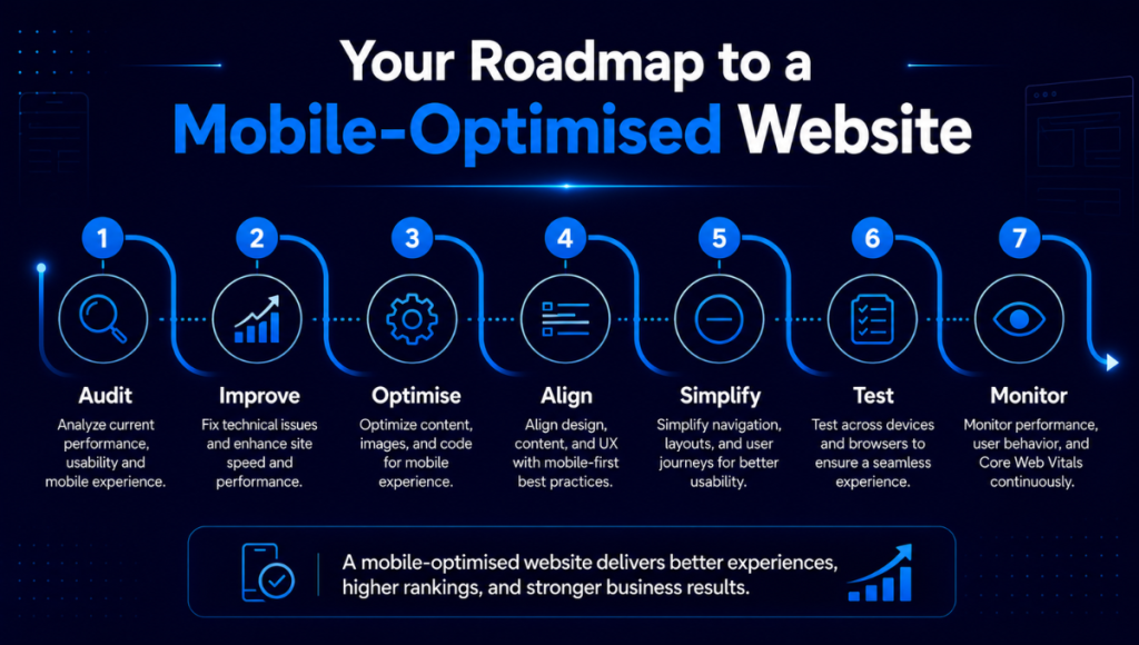
Mobile SEO focuses on the design, content, and structure of websites for those who browse on the go. The intent of AI SEO is to minimize zooming, horizontal scrolling, and waiting on heavier elements to load while still offering the same valuable information and functionality as the desktop version. Features of a mobile-optimized website:
- Loads faster on a mobile connection
- Automatically adjusts to all screen sizes
- Displays legible text without the need to zoom
- Provides buttons and links that are easy to tap
- Utilizes a simplified and easily accessible navigation
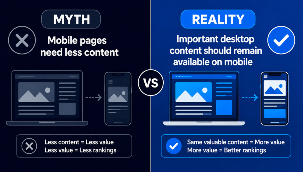
- Has all the significant content as the desktop version
- Allows search engines to crawl mobile pages
- Has simplified forms, payments, and inquiries
Why Is Mobile SEO Important?
Google examines a website’s mobile version when determining how a webpage is presented in search results. Thus, if certain essential elements (like internal links, metadata, or structured data) are absent from the mobile version of your website, your site’s rank in search results may suffer.
This seo strategy explains why you should also consider page speed, layout, and design. All of these can affect how your visitors behave after arriving at your site. Any of these elements that are poor can cause your visitors to leave before they are able to accomplish the action you desire.
Google suggests taking a comprehensive view of page experience, as opposed to focusing on a particular measurement or ranking factor. Usability on mobile, high-quality content, safety, speed, and considerate page design should all function as a unit.
Ways to Optimize Your Website for Mobile Users
Speed up loading times and simplify navigation by using touch-friendly elements. This type of mobile-friendly design enhances usability. Below is a mobile SEO checklist:
Use a Responsive Web Design
With the same HTML data, responsive web design customizes a website for desktops, tablets, and smartphones. The organization of menus, images, text, and sections shifts with the different screen sizes. Responsive web design focuses on:
- Adaptable page grids
- Images and videos that can scale
- Navigation that is friendly to mobile devices
- Breakpoints that are appropriately set
- Typography that is flexible
- Right viewport meta tag settings
- Components that can resize and will not overlap
Page testing will reveal horizontal scrolling. This is caused by fixed-width tables, large images, and oversized elements.
Improve Mobile Page Speed
Mobile users typically have slower connections. Mobile devices can be less powerful than desktops. A mobile-friendly website can be slowed down by large images, scripts, plugins, animations, and especially video backgrounds.
Compress and Resize Images
Image optimization is important and should be compressed and made smaller with newer formats like WebP or AVIF. Modern responsive design makes it possible for a browser to receive the appropriately sized image.
Reduce Unnecessary Code

This will help speed a page. Essential files can be made smaller, and bad design practices such as third-party widgets should be limited.
Use Browser Caching and a CDN
These tools make your website development resources closer to the user and store them on a user device, helping speed your page.
Enable Lazy Loading
Images and videos can be delayed to below the fold as users scroll. This helps content that is more important load first.
Optimise Core Web Vitals for Mobile
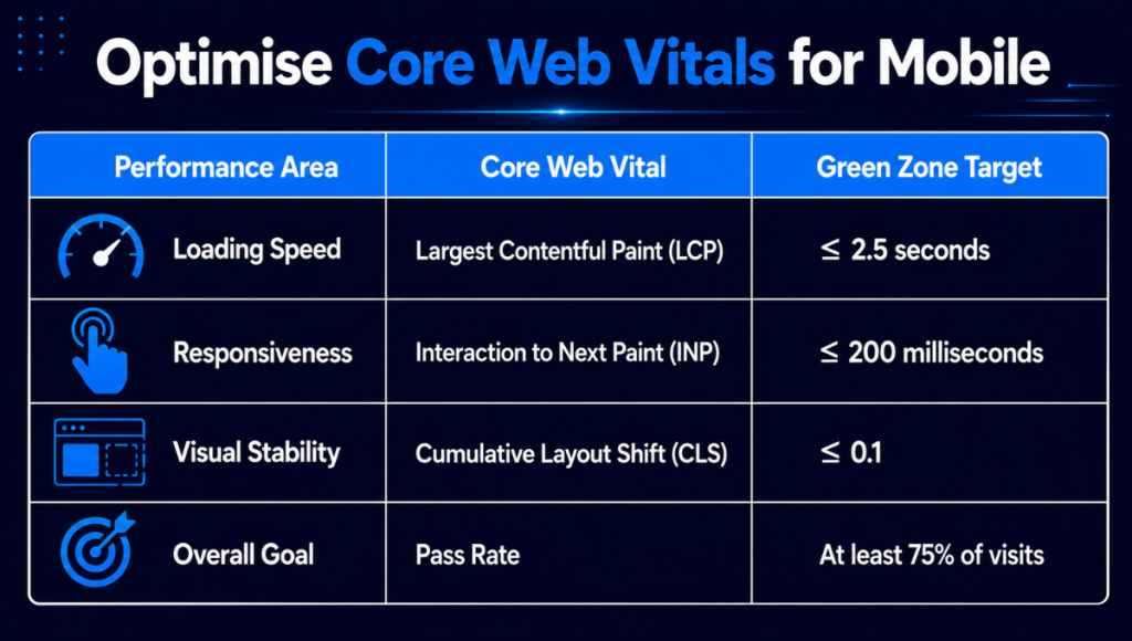
Core Web Vitals evaluate loading speed on mobile, responsiveness, and visual stability. There are three primary metrics:
- Largest Contentful Paint: Content should load in 2.5 seconds.
- Interaction to Next Paint: Page response should happen in 200 ms.
- Cumulative Layout Shift: The score should be 0.1 or less.
Targets should be met on 75% of page loads. You can check performance with mobile SEO tips such as:
- Google PageSpeed Insights
- Google Search Console
- Chrome Lighthouse
- Chrome DevTools
- Real-user monitoring tools
Be sure to test different page templates for different product and content category pages as the issues may differ by page type.
Keep Mobile and Desktop Content Consistent
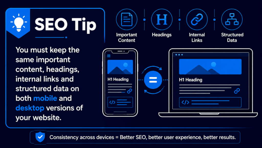
Mobile-first indexing requires functionality of both pages in that mobile pages contain all the essential elements of desktop pages (headings, text, images, links, metadata, structured data, and robots instructions). If you want to keep content visible to users and search engines, consider using tabs, accordions or expandable sections.
Create Mobile-Friendly Content
To improve the readability of your content management system, use short paragraphs, clear H2s and H3s, simple sentences, white space, and relevant visuals. Consider the importance and size of your content. You should place relevant content toward the top and sized appropriately (to make your mobile page easier to scan) while avoiding oversized content.
Improve Mobile Navigation
Consider the importance of your content as one of the important SEO KPIs. Your navigation should help users get to the most important pages quickly. Use clear labels, search, breadcrumbs, high-priority links, a clickable logo, touch targets that aren’t crowded, but aren’t too spaced either.
Optimise Mobile Forms and Calls to Action
Forms should be short. Use the correct type of keyboards for the type of fields, and provide clear labels. Use large buttons to assist with Calls to Action, which should be visible and not contain intrusive pop-ups that cover the main content.
Strengthen Local SEO for Mobile Searches
To assist local searchers, businesses should optimize all relevant areas of their Google Business Profile as well as contact details, opening hours, service areas, reviews, location pages, maps, and click-to-call links. Each location page should have useful and relevant information for that location.
Common Mobile SEO Mistakes to Avoid
Mobile Search Engine Optimization problems are becoming common among mobile users and are usually attributed to the design of the mobile site rather than the quality of the content offered. Design problems encountered often include:
- Leaving important information off the mobile site
- Uploading very large images
- Using very small text
- Putting links in very close proximity
- Creating obnoxious and distracting pop-ups
- Blocking important styles and scripts from the site crawlers
- Using fixed-width mobile site layouts
- Adding several site animations
- Building user input forms that are unnecessarily longer and complicated
- Ignoring mobile performance analytics
- Testing only on desktop computers
- Incorrectly using separate mobile site URLs
To avoid suffering a substantial decline in site users due to not being able to convert visitors to users, a mobile SEO audit should be carried out regularly.
Apply Mobile Technical SEO Best Practices
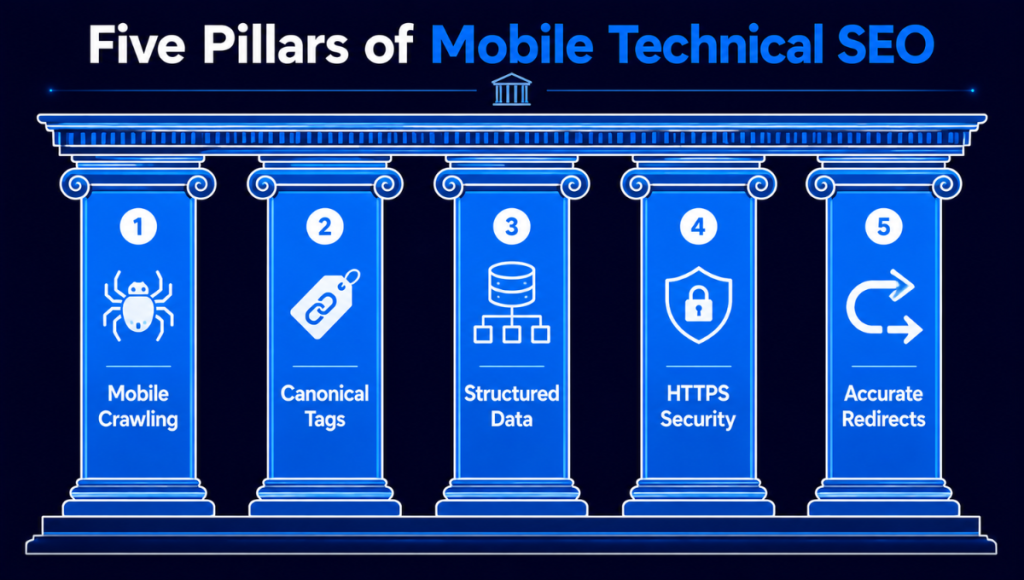
Technical challenges can lead to search engine results failing to access and interpret mobile pages. Consider the following:
Mobile Crawling
Ensure important resources are not blocked by robots.txt. Mobile pages will be essentially viewed by search engines as being constructed with the resources you have allowed them to crawl. If important resources are blocked, search engines will not be aware of them.
Canonical Tags
In a responsive design, the same URL is used for the desktop and mobile views. If separate mobile URLs are used, make sure canonical and alternate tags are used properly.
Structured Data
This should be present on both mobile and desktop pages and should be consistent. Also, ensure that the appropriate structured data (product, article, business, review, breadcrumbs, etc.) is present based on the content.
HTTPS
Maintain a secure and mobile-friendly site by using HTTPS on the entire site. It is one of the factors that make up the overall user experience.
Redirect Errors
Mobile users should be redirected to the same content they would see on the desktop. Avoid redirect loops, broken pages, and the mobile version of pages that return a 404 status.
Techbuzz– Trusted IT and Digital Marketing Solutions

TechBuzz offers top-quality, cost-effective IT and digital marketing solutions to clients in Pakistan and abroad. It has a talented team of web designers, developers, and marketers who prepare tailored solutions within flexible and unique scopes of work while ensuring quality, professionalism, and satisfaction are met.
Conclusion
For a website to attract visitors and satisfy search engines, mobile SEO is key. It is not enough to implement responsive design. Website owners must also enhance speed and mobile usability, form accessibility, and consistency of content and navigation, as well as the site’s technical underpinnings.
First, make sure to test your site on real mobile devices. Make use of Core Web Vitals as well and compare mobile content against the content as it appears on the desktop version of the site. Text that is too small to read or complicated navigation that results in unstable page layouts should be prioritized. These are the biggest challenges you should be addressing. Contact us today to discuss your IT and digital marketing needs and discover a reliable, customised solution for your business.
FAQS
How Does Mobile SEO Differ from Desktop SEO?
Mobile SEO looks at how websites are crawled, displayed, and used on mobile devices. Mobile SEO examines responsive layouts, touchscreen navigation, mobile page speed, content display, and smaller screen sizes. Desktop SEO analyzes the same content and technical factors, but mobile device SEO considers more about the limitations of the device and the behavior of the user.
How Do I Know if My Website is Mobile-Friendly?
To see if your website is mobile-friendly, you need to look at the most important pages on mobile devices and examine the speed, size, navigation, forms, and buttons that are displayed on multiple mobile devices. Google PageSpeed Insights, Chrome Lighthouse, and the Google Search Console can also help you find performance, usability, and Core Web Vitals issues. You need to test more than just the homepage in your website mobile-friendliness evaluation.
Do Mobile Pages that Load Faster Improve SEO?
Mobile page performance contributes to the overall website experience, and Fast Mobile Pages are one of the Core Web Vitals. Speed is important, but there are other factors to consider to improve SEO and website performance. There is good content, crawlability, relevance, internal linking, security, and usability. There are also conversion benefits to mobile page speed.